Setting the Scene
Visual design has become a make-or-break factor in successful eLearning content development. While great instructional writing is essential, how that content is presented visually determines how easily it’s absorbed—and how willing learners are to engage with it. In a digital-first learning landscape, we must treat design not as garnish, but as a key instructional element. This article explores why visual design matters, how it boosts engagement, and the role it plays in turning passive viewers into active learners. From layout and colour to accessibility and emotional tone, every design decision affects the learning journey. When we take visual design seriously in eLearning content development, we unlock new levels of clarity, motivation, and impact. Ultimately, this thoughtful approach drives better learning outcomes.
Why Visual Design Matters
Visual design in eLearning content development is far more than just decoration—it’s a key player in learner engagement and retention. How content looks directly influences how it is perceived, understood, and remembered. Thoughtful design creates a sense of clarity, confidence, and comfort, allowing learners to navigate content with ease and focus on what matters most. Clean layouts, consistent iconography, purposeful colour palettes, and intuitive navigation structures all shape the learner’s experience. Therefore, when eLearning content development incorporates strong visual design, it creates an environment that supports the message instead of competing with it.
Visual design is also a form of communication. It can direct attention, signal importance, and make content more approachable. Moreover, when we design intentionally, we build not only trust but also momentum. This is especially important in self-paced learning environments, where visual cues replace the presence of a facilitator. Consequently, if eLearning content development aims to be effective, then visual design isn’t optional—it’s essential. It sets the tone for learning, simplifies the complex, and builds a clear path forward for every type of learner.
First Impressions Count
Before learners even begin reading or interacting with a course, the visual tone makes a statement. A clean, polished first screen with branded visuals and clear calls to action sets a professional tone and creates trust. That first impression matters because it frames how the learner feels about the course—and whether they’ll stay engaged. If the design feels outdated or inconsistent, the learner might assume the content is too. However, when the design is sharp, modern and intuitive, it sparks curiosity and encourages confidence. It’s the invitation to learn.
First impressions in eLearning content development are often underestimated. But they’re pivotal in determining whether someone clicks through the next slide or bounces. A good visual first impression communicates relevance, credibility, and effort—assuring the learner that their time is respected. As a result, this can shift the mindset from passive obligation to active interest, and that single shift can drastically improve how deeply someone engages with the course.
5 Design Must-Haves
To maximise the impact of eLearning content development, visual design must be deliberate and learner-centred. Below are five foundational principles that make visual design in eLearning effective:
1. Design Consistency Matters
A cohesive design system helps learners feel at ease. Repeating elements like colour schemes, font styles, and icons ensures the interface feels familiar. This reduces the cognitive load and makes it easier for learners to focus on the actual content instead of how to navigate the platform. When consistency is applied throughout the course, learners know what to expect and how to interact with different elements, which boosts overall comprehension.
2. Clarity Above All
Every visual element should have a clear purpose. Use visual hierarchy—such as bold headers and appropriate spacing—to guide the learner’s attention. When the design is clutter-free, it’s easier to absorb and retain information, leading to a smoother learning journey. Furthermore, the fewer mental hurdles learners face, the faster they can progress and build confidence in their understanding.

3. Designing for Accessibility
Visuals should be inclusive. That means high-contrast colour choices, readable fonts, and compatibility with screen readers. Accessibility broadens your course’s reach and supports all learners, regardless of their abilities or learning environments. Additionally, it aligns your training with ethical and legal standards, showing that your organisation cares about equitable learning experiences.
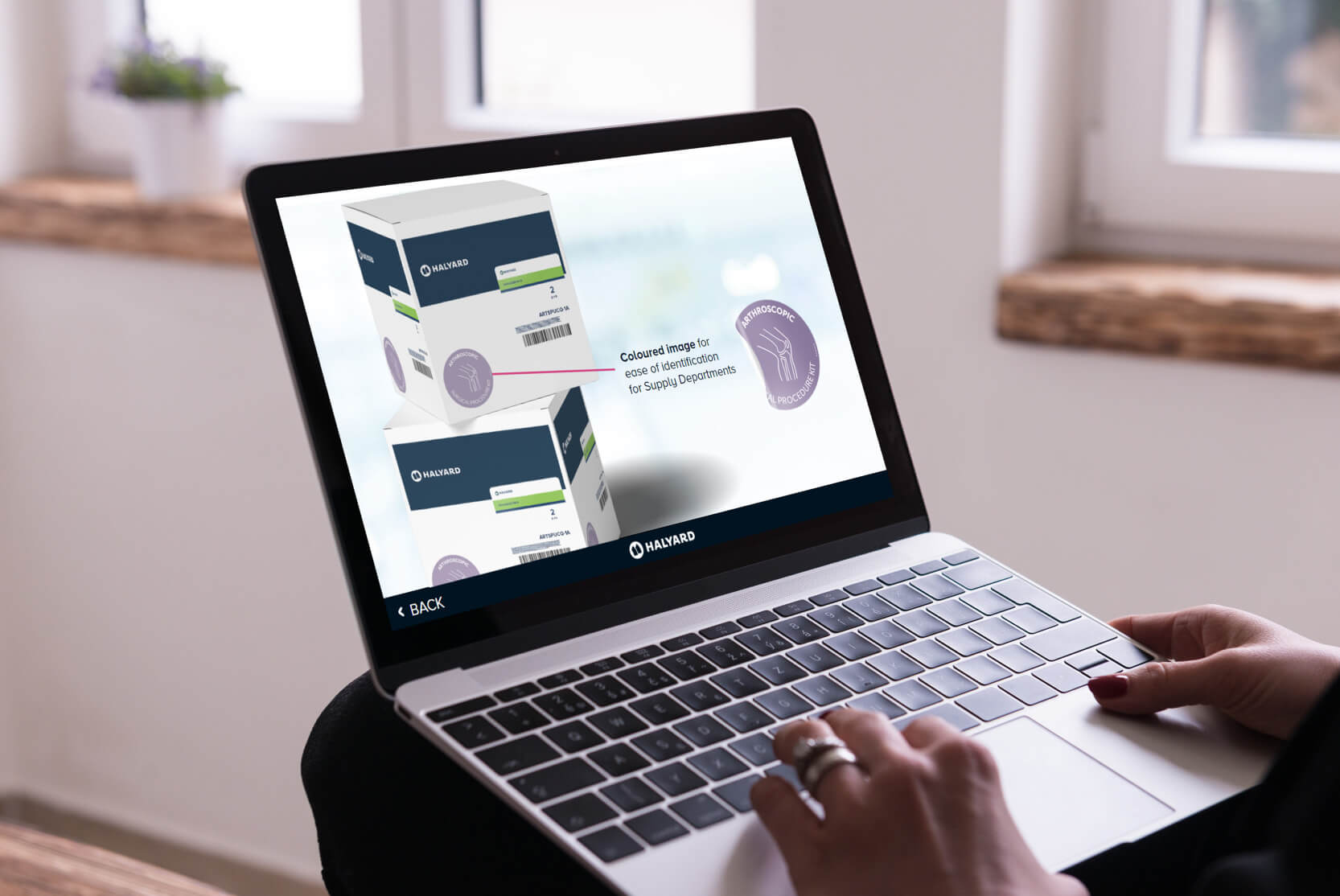
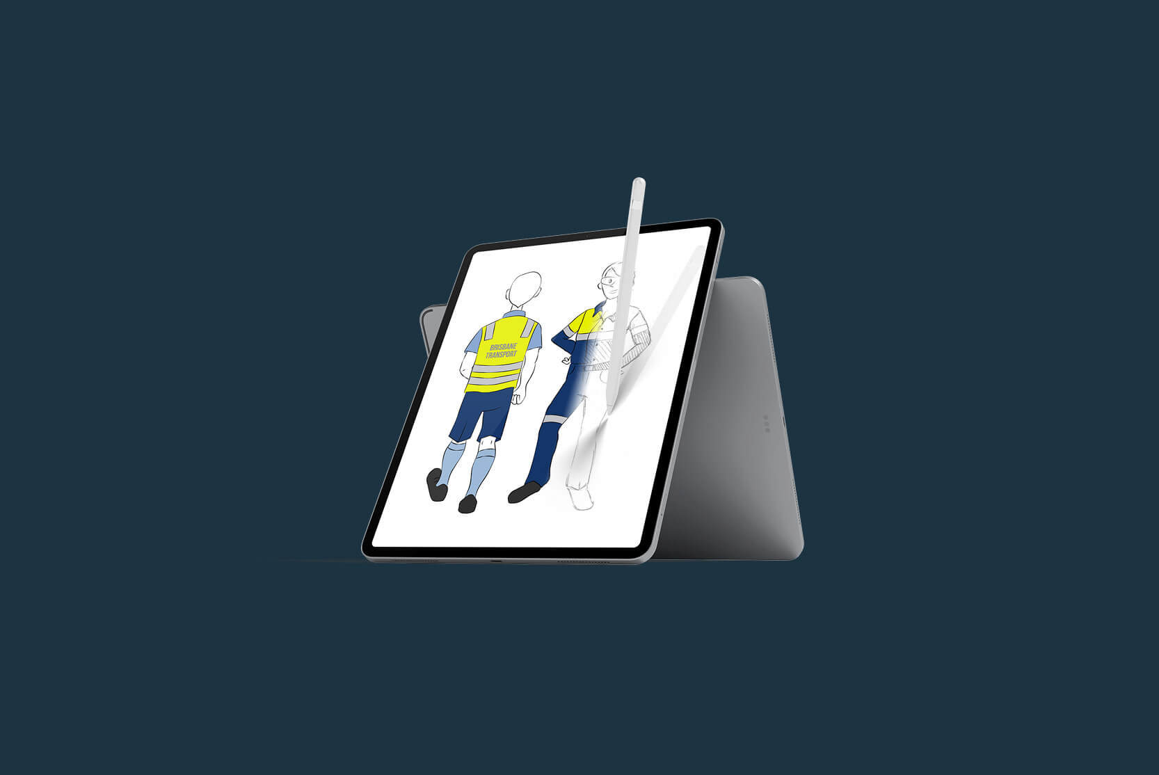
4. Relevant Visual Content
Imagery and animations must support the content, not distract from it. Custom visuals that reflect your brand or work environment improve relatability and practical application. Avoid generic stock photos that feel disconnected from your learners’ reality. When visuals feel authentic, they help bridge the gap between theory and practice, making the course more impactful.

5. Device Responsiveness Wins
Learners are increasingly mobile. Your eLearning content development should adjust to all screen sizes seamlessly. Responsive visual design ensures clarity and functionality on desktops, tablets, and smartphones, allowing learners to access training wherever they are. Without responsive design, you risk alienating part of your audience and reducing course completion rates.
Emotional Design Elements
Design isn’t just cognitive—it’s emotional. In fact, how a learner feels while taking an eLearning course has a direct impact on whether they stay engaged, retain knowledge, and return to the material later. Visuals can evoke emotion, create mood, and support storytelling in powerful ways. From soft gradients and organic shapes that make a course feel calm and approachable, to bold typography and colour that signal urgency or excitement—visual design can frame emotion as well as information.
When learners feel confident and safe within a course, they’re more open to absorbing new information. That’s why good eLearning content development isn’t just about what’s being taught—it’s about how it feels to learn it. Emotionally resonant design builds trust, drives motivation, and keeps learners coming back. Whether you’re creating safety training, onboarding, or leadership modules, emotional tone matters—and visuals are one of the fastest ways to get it right. When done well, emotional design strengthens the connection between the learner and the content, making the learning journey not only effective but enjoyable.
Avoiding Design Pitfalls
Not all design choices are helpful. One of the biggest challenges in eLearning content development is resisting the urge to over-design. Adding too many colours, fonts, transitions, or unrelated visuals can overwhelm and confuse learners. Another common mistake is using generic stock images that don’t represent the real work environment or reflect the learner’s experience. This breaks immersion and reduces relatability. To avoid these pitfalls, designers must always return to the learning goal. Ask: does this visual support the message? Does it make the learning easier or more memorable? If the answer is no, it’s likely not needed.
Cluttered screens, inconsistent navigation, or visuals that compete with the content all create friction. And friction in learning equals disengagement. Effective eLearning content development is about removing that friction—not adding to it. Therefore, the most successful designs are often the simplest, clearest, and most aligned with the course’s purpose. Being selective with design choices leads to a stronger, more focused learning experience.

Final Thoughts
Great visual design in eLearning content development is what turns information into experience. It anchors understanding, encourages exploration, and creates learning environments that feel purposeful and professional. More than that, it makes your course memorable. A well-designed course respects the learner’s time, supports their confidence, and enhances the impact of every message you want to deliver.
At Simply eLearning, we don’t treat design as an afterthought—it’s at the core of everything we build. Because we know that when it looks right, it feels right. And when it feels right, people learn better. If you’re looking to elevate your training, visual design is the place to start. Whether you’re refreshing existing modules or building from scratch, thoughtful visual design is a strategic tool for deeper, more lasting learning outcomes.
Get in touch with us today and let’s build something meaningful together.